Tuesday 21 May 2013

Design Practice 2 // End of Module Evaluation - OUGD505


1. What skills have you developed through this module and how effectively do you think you have applied them?

As this has been quite a long module I have definitely learnt a lot during this module, but when it comes to skills that I have developed, I would say my concept development has improved a great deal, i am now considering whether ideas i produce are both relevant and appropriate for the task they are assigned to do. In this module specifically i have tried to develop my concept to a point where both the products created and the topic chosen both appropriately link and target the correct audience, I feel he products I have created are like no other Ale on the market and is specifically directed at a younger male audience and the products I have included were designed with the specific target audience in mind.


Using photography as a design tool. This is not the first time I have used photography in a brief but I am trying to present my work in a much better looking way when it comes to Product shots I take of my work, I have spent more time this module taking nice photographs of my work and using them in presentation boards and design work. This is an area i really enjoy, and have mentioned n previous modules photography is a tool I would like to develop even further.


2. What approaches to/ methods of design production have developed and how have they informed your design development process?
 
I have tried to experiment a little more with my production techniques as well and have tried to mess around with different ways of effectively using the laser cutter, for both my exhibition poster and what is good briefs I have tried to stay away from just using digital print to create the final outcome.  

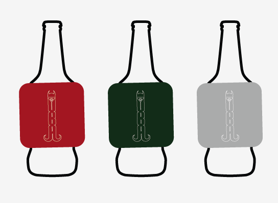
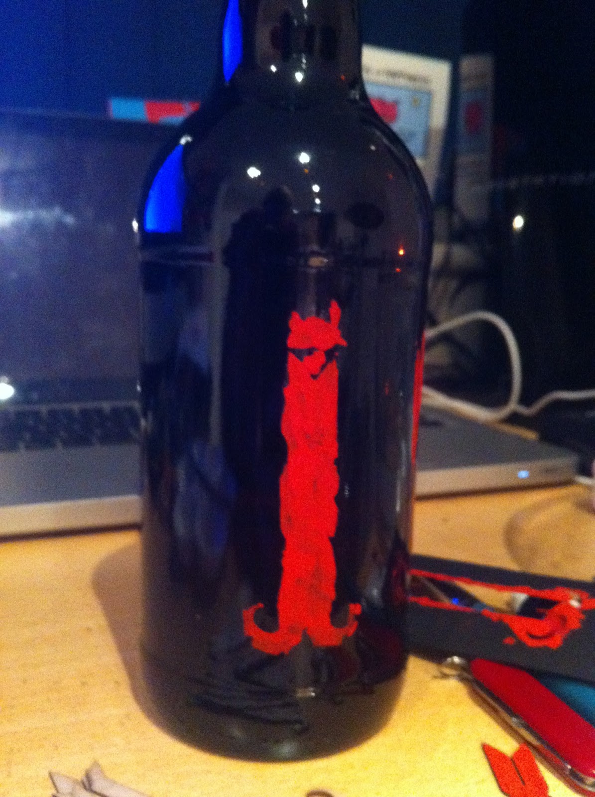
I also set out at the beginning of this brief to not just create a series of 2D products that are all printed, I wanted to experiment with working with 3D products and design how they will work rather than just what they look like. In this module I would say creating a working bottle opener was an example of how I have designed a working product rather than just what would be printed on it. Obviously it isn't made out of metal so it doesn't actually work, but if it was then it would, and I am quite proud of the fact i have designed it all revolving around the same logo.

The product of the labels may not have been appropriate if the bottles were being mass produced as at the minute they are made out of mount board and double sided tape, however I tried to experiment with different ways of transferring the labels onto the bottle and many of them were unsuccessful, but visually i am really pleased with the outcome.


3. What strengths can you identify in your work and how have/ will you capitalise on these?


With both the aid of this module and context of Practice, I have really developed my theoretical and practical knowledge when it comes branding and logo design. It is something I am really interested in and I am considering focusing on this for my dissertation next year, I think I have developed the practical skills in this module of creating a logo that is both visually acceptable for the brand it represents and conceptually appropriate for the audience it targets. I know in this brief most of the products I designed / created just consisted of solid colour and variations of the same logo, however i was not aiming to just put the logo on a load of products, but instead trying to develop a logo that could be used as the main base of all the designs on all the products, similar to Nike, their logo is all they use for any design on any product, whether it is sports wear,equipment, advertisement etc.


4. What weaknesses can you identify in your work and how will you address these in the future?
My organisation skills are still no better if I am being perfectly honest, many of the design production decisions were forced as I was having trouble booking any time in the print room as it is such a busy time of the year. this forced me to think of other ways of producing my product range, which in the end I am quite happy that I did. However I would have had more control over the production method if I would have thought in advance and booked several print slots over several weeks, so I would always have an option available.
I would have liked to produce more items revolved around the branding and identity of the beer packaging, I found that I struggled the last couple of weeks to juggle both CoP and this module hand in, therefore I was focusing mainly on CoP and then had to rush this module more than I would have liked and again this is down to bad time management. I need to learn that taking the first step is the most important one, I always find it so difficult to start the design stage and I get more scared the longer I leave it but once I have done the first bit that is when I really start to enjoy a brief so I need to start getting on a brief as soon as we get it instead of putting it to the back of the list until everything else is out the way.


5. Identify five things that you will do differently next time and what do you expect to gain from doing these?

- Use a different printing method for any products I create, I am specifically talking about screen print as it is the one thing I really want to do that I am too scared to try, so I need to man up and get on with it.


- Start briefs earlier so I will have more time to be able to make more mistakes and have time to re do them, it would be nice to create my final pieces at least a couple of days before the deadline so I have time to make changes if I need to where as at the minute it seems I have to put up with the mistakes as I don't have enough time to correct them.

- Brand as many appropriate products as possible and actually produce them all, I would have liked to create stationary and other pub promotional products in this brief but again dues to bad time management I ran out of time and mainly focused on getting the main products and concept perfect.

- Play around with more initial ideas, I had a pretty good idea of what I wanted to create at the research stage of this module, so when it came to the design stage I had, had time to visually work out what I wanted to do, bt it would have maybe been more beneficial to play around with a few more ideas first.

Use as many finishing techniques as I can, really need to use them as much as possible next year because I would like to be confident in using them and understand them before I move on, they are really useful design tools and I have found that many product outcomes don't look great because they have an awesome design on them, they look great because of the way they were printed, the substrate they are on, the gloss they have etc. so i want to take advantage of those more in the next module.


6. how would you grade yourself on the following areas? 


Attendance -3

Punctuality - 4

Motivation -4

Commitment -3

Quantity of work produced - 3

Quality of work produced -4
Contribution to the group -4

Design Practice 2 // Viking Beard Ale Final Product presentation boards


Monday 20 May 2013

Design Practice 2 // Viking Beard Ale - Final product shots

 The products that I have ended up with would obviously never survive the real world of manufacturing and retail, but I think I have produced a  nice start at least to propose some of the elements, for example the Bottle opener / necklace would come in the colours and shape I have use but would obviously have to be made out of steel.

I am really happy with my final products to be honest, I was a little worried towards the end that it wouldn't end up the way I had initially planned but overall I am really pleased with my branding effort as well as the production of the final pieces.


Design Practice 2 // Viking Beard Ale Personalities publication

This publication is pretty much just for another visual element, it could have contained information about each different personality, maybe and explanation of the taste or the type of personality the beer suits, but as there is no actual beer company at the minute I thought it would be pointless studying up and writing descriptions of beers that don't even exist but never the less I this this nice little booklet just helps the consumer gain a sense of what each personality is about.

It also gives a good format to display some nice product shots and photography however some of the photography in the publication was not taken by me.


Saturday 18 May 2013

Design Practice 2 // Possible way of displaying product in shops

As one of the concepts would be to give away a free beer mat with any purchase of VBA, and considering for my proposal I used the negative cuts from the beer mats to form the label for the bottles, technically the coaster could be slotted back over the logo, so it is attached to the bottle, so when people purchase a beer they can just pull the coaster off, the label remains where it is and the coaster can be used with the design cut from the center.


I think this would create a unique visual appeal to the beer and in some cases people may just purchase the beer just because you get a free boaster, and when you peal the coaster away and the design is still attached to the bottle i think that is a cool and interesting design aspect.


Thursday 16 May 2013

Design Practice 2 // Bottle Label production

My original idea for the production of the bottle labels was to get individual labels printed onto vinyle stickers and cut on the cinyl cutter, however after considering this I would have problems as the vinyle stickers once printed and stuck on have either a transparent or white back ground which if transparent would cause the logo to be too dark on the bottle and now be seen, or each logo would have  white backround which visually wouldnt be that appealing.

Therefore i then decided I would cut the design out on the laser cutter and use the stencil created to paint the design onto the bottle,


 As you can see, as the stencil doesn't include the bowls of the B  and because the stencil wouldn't stay flush with the bottle, the result of using paint and a stencil didn't really come out that well, so I had to re think how I was going to produce these labels. For the sake of the design I just want to create a representation of how the label would look rather than creating the completed article that is water proof and damage proof.

I tried to use the negative element of the laser cut to use it as a stamp, to see if that way of transferring the image would work, however as the glass is a glossy surface and the paint it wet, the stencil just slipped around on the bottles surface so no clear image was transferred.


I was getting a little worried at this point that i was going to have to completely re think how I was going to produce these bottles, and as time is running out until the deadline i could really do with getting this production stage out of the way.

However, from laser cutting the Beer mats I was left with the negative mountboard cut outs. So I saw the opportunity to use these as the label representation, they also give a really interesting 3D effect which I personally think looks really nice. I mixed the 6 colour out of Gouache paint and painted each logo it's own individual personalities colour, the effect of using gouache pain creates a clear bright and vibrant range of colours which look great as a set.


For now I have just attached the mountboard labels with double sided sticky tape, as non of the glues I have used stick the label to the glass. but for now I think they give a good looking representation of my intentions for the bottle visuals.


Design Practice 2 // Necklace / Bottle Opener design and Production

One of my main aims was to create a bottle opener which both worked and linked to the visuals I have created for the brand, Having spent a long time developing the logo and working out that by adjusting the logo shape i could utilize it as both a logo and a proposed bottle opener.


I altered the design slightly to attach the helmet to the beard, and incorporated a whole to attach the necklace / handle element, I suggested that it is both a necklace and a bottle opener as I feel many people may use it as a fashion accessorise as rustic style , string made necklaces are a hipster fashion at the minute, but it's main function would be a bottle opener, bar tenders could wear it round their neck while they work, which promotes the beer and shows the brands versatility.

As I very much doubt I will have enough time to make an actual metal version of this bottle opener, I will again use the same mount board i used for the Beer mats, just to propose how they would look and work as a set.


 Once cut out I again matched a bottle opener to each colour so they could either work as a consistent set or people could mix and match colours depending on their preference.


As you can see below, the bottle opener would come attached to the bottle which with the string I have chosen adds another rustic element to the design which again links well to the Viking way of life. or they can be given out separately with purchases or bought from hipster stores around the UK. 


Below is an example of how it would work as a bottle opener, currently being made out of mount board it doesn't actually work, but it would if a metal version was created.